Taylor Community Library
The Problem
On March 7, 2022, The Taylor Community Library reached out in regards to their website’s insufficient information architecture.
“We are in dire need of having our website redesigned from the ground up with emphasis on easy to access information and welcoming thematic elements. Our current website look is quite dated from a technological perspective, and while there is an abundance of information, it can be daunting for our users to FIND that information (i.e. it could be organized much better).
We’d like to take the content that is on the current site and have it reworked so that it is easy for our patrons to find exactly what it is they are looking for, be it the online catalog, information about preschool story times or downloading a meeting room application form.”
Original TCL Website
Project Goals
In response, a project to modernize the information architecture of the Taylor Community Library website was carried out with the following goals in mind:
Evaluate and iterate the site’s taxonomy and labeling system
Restructure the site’s organization and classification scheme
Identify the site’s primary & secondary users, along with highly prioritized tasks
Increase findability metrics for the site’s primary & secondary users
Structure content layout to further assist navigation
Allow for future growth and expansion of additional content
Approach & Activities
In an effort to maximize time and efficiency, the LUMEN model was utilized to outline the approach and activities throughout the evolution of the project.
Research
Research consisted of a literary review of four sources, along with two individual
stakeholder interviews
The stakeholder interviews were conducted with librarians, independently and synchronously.
The Literary Review consisted of academic sources that were analyzed in an effort to provide complementing quantitative data.
Key Findings —
Primary users of the site are adults. Teens and parents are also considered primary users
Children do not use the site unless their parent’s do on their behalf
Majority of site users are readers with a higher education
There is much overlap (73% in 2021) between in-person and website users
Most library patrons know what they want, but do not know how to find it
Accessibility is key. The website must be accessible by everyone and anyone
Sierra is the complex intranet system used by librarians to maintain materials.
Lack of administrative control over Sierra along with other third party apps often frustrates librarians
Teens often browse for recommendations and reviews, teens use the catalog less often than other user types
Only having partial information is often the culprit in frustrating users who have trouble searching for their desired content.
Librarians often use Google and Amazon as tools to help locate materials for patrons.
Library sites often struggle due to the lack of meta-tagging and content maintenance
Data Synthesis
Affinity Diagram
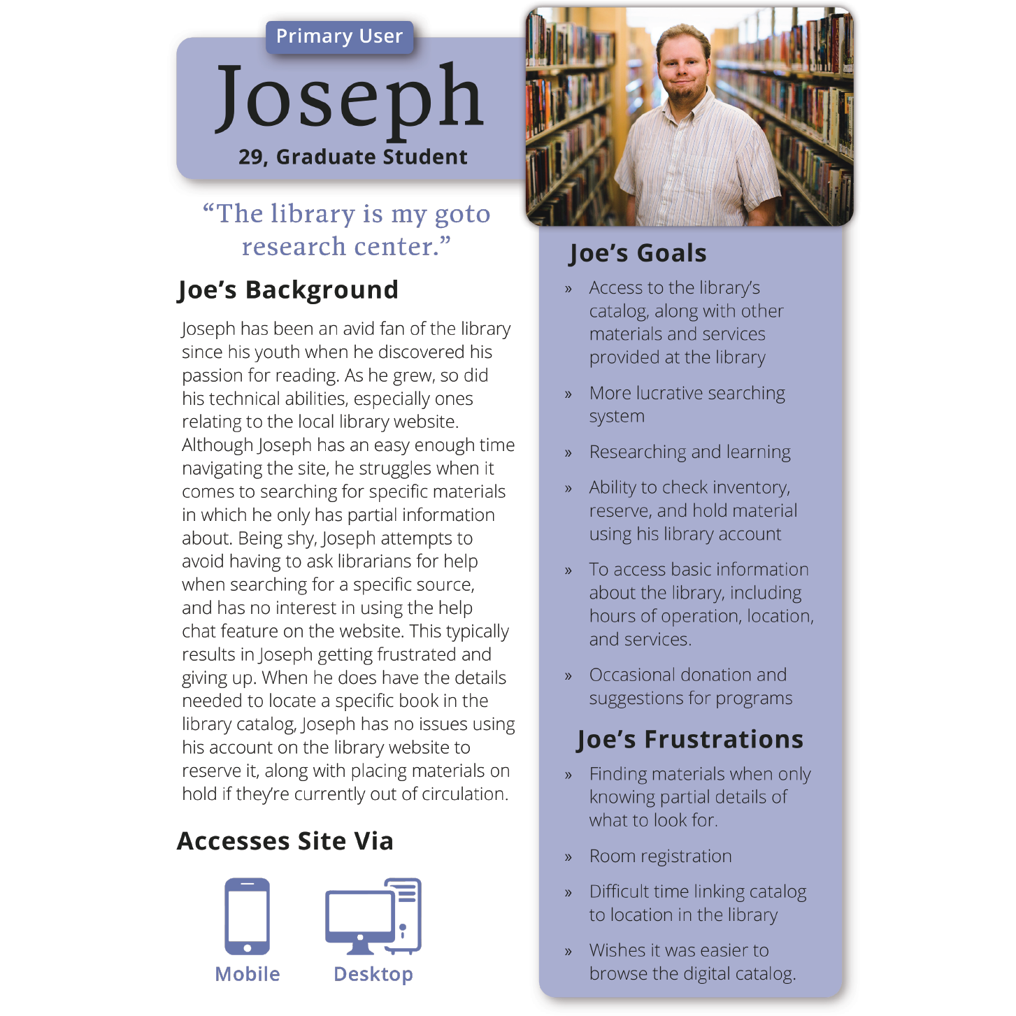
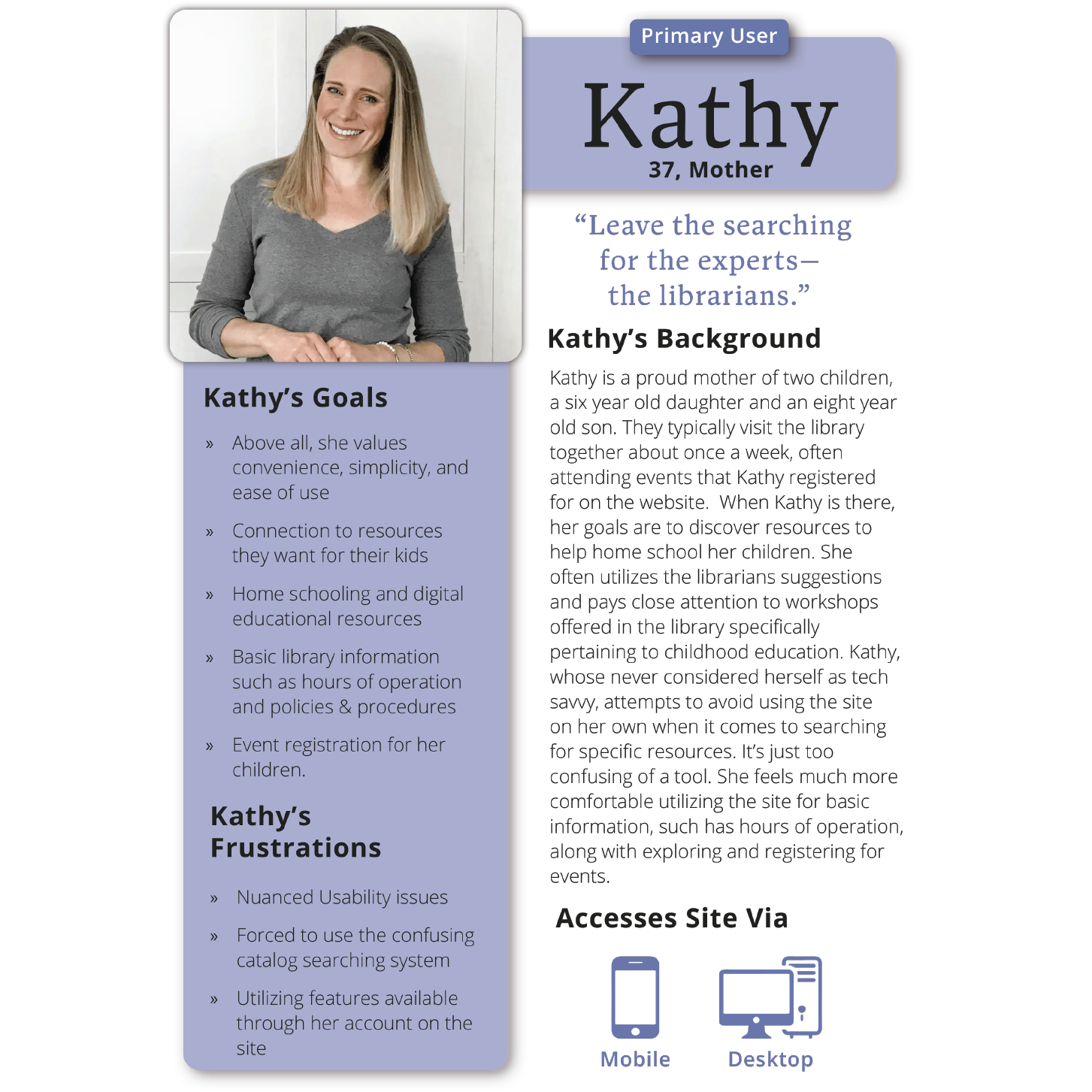
After initial research concluded, an analysis of the results was conducted using an affinity diagram, which revealed common trends and patterns of library website users. These trends have been utilized to create four archetypical personas, which in conjunction with a series of key tasks, guided the redesign of the Taylor Community Library website.
Personas
Key Tasks
Content Analysis & Navigation Structure
Sample of the content analysis of the original TCL website
The redesign process began with an in-depth content analysis of the initial site, which provided a deeper understanding of the site’s content. It also granted the opportunity to sort through what can be kept, reworked, or removed altogether.
A sitemap was created to reflect the new site’s navigational scheme. The main organizational structure used in the redesign is hierarchical, accompanied by an ambiguous, subject based classification scheme. This type of scheme / structure pattern is most common throughout the web, simply because hierarchies and topical taxonomies are how people tend to organize information naturally.
In addition to global navigation, each nested page within the site’s hierarchy features a local navigation. This allows the user to better understand their orientation, while easily visualizing and exploring the localized section.
In addition, the site utilizes supplemental navigation of the its catalog via an embedded digital database, which is featured on the event page as well.
Sitemap
Testing & Iterating
Lo-fi wireframes allowed for treejack and first-click usability studies to test the redesign’s functionality and findability of the user’s key tasks. Multiple rounds of iteration gave way to a final hi-fidelity wireframes which was delivered within a final report to the client.
The Results
Home
Hours & Location
Events
Library Catalog
Lessons Learned
This project emphasized just how crucial findability is in eliciting a positive user experience. Find out what the user’s goals are, prioritize them, and make them as easily discoverable as possible.
Orientation, or the context in which a user views themselves within an organized structure, is fundamental in establishing any coherent communication between a system’s image and a user’s mental model.
Pairing mockup iterations with usability testing is extremely effective when developing a usable product. The more rounds you conduct, the more efficient your product becomes.


